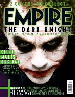
The first thing I notice on this magazine front cover is that the picture of the actor is in its costume is on the front cover and it is very clear who it is. This is why I chose to put of a picture of my actor on the cover. Also the title of the film the character is from is on the magazine and it is big clear letters. I have also included this on my magazine cover. This is so the audience establish where the character is from. The release date and the price are done in small print on the poster. This is because it is not the main part of the poster and they do not want it to dominate the poster. The bar code is also included on the side so I have chosen to do this as well. The name of the magazine is at the top, this is the main part of the cover as this is the main title. There is also other information on the cover about other films but the main focus is on the film where the character on the cover is from. It is also explains that there is going to be an interview with this character but in my cover I have been more specific as I wanted them to fully know this who the interview is going to be with whereas in this poster its not as specific it only says '12 pages' but the viewer is still able to establish that it is about this character.

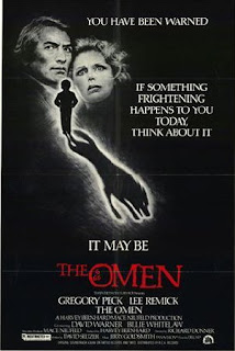
This poster appears to have its tag line on the side. This is so that it is more noticeable to the audience and the writing is in white so it stands out as the background is black. I chose to layout my poster like this as well as I thought that it looks more authentic and the white writing would make mine stand out as well as the background is dark. There is also another shorter tag line at the top and the writing is slightly bigger so it is more noticeable to its audiences. I have chosen to do a similar thing but I have a question at the top instead. This makes the audience think more and get them more excited and builds up the suspense. Most of the writing is white apart from the title which is red. This is to symbolize the colour of the devil and it also makes it stand out and gives it more authenticity as well . The names of the actors and the directors are at the bottom and are in small writing as it is not an important part of the poster and most of the actors are not very well known apart from 2 and there names in a slightly bigger font so it looks better for the film. The picture is not very reflective of what the film is about. This is because it is a teaser poster and is not supposed to give away to much of the plot so it is teasing the audience.
In what ways does your media product use, develop or challenge forms and conventions of real media texts?
For my coursework I decided to create a horror teaser trailer. Following a long with this I did a magazine front cover and a poster. In my evaluation I will discuss how I created this to a successful level.
The film content I used was typical of the horror genre as I filmed in the night time. I used different methods to conform to the tradition. One of the ways was using different qualities of lighting to create a spooky effect. For example outside I had the lighting of the street lamps. I also chose to hide the character’s identity by getting them to wear a hood over their head so it adds to the sense of mystery. I also hid the identity of the person in the bed to keep the audience on edge.
I used the conventional technique for a trailer which was to show short sections of certain scenes which reveal the premise but do not reveal too much of the plot. I developed this idea by presenting the scenes in chronological order so they form a coherent whole which has an atmosphere of its own. I created a teaser trailer so I used the convention of revealing less in order to keep this sense of mystery.
I chose the horror convention of building up the suspense. I did this by becoming more specific as it progressed. I chose to begin with an establishing shot of the house and then move to an active shot which is following a character walking up the stairs. I did this to engage the audience and to keep them guessing where the character is going. In the third section we see the same person in someone’s bedroom and standing over a bed. The person in the bed’s identity is not revealed and the assassin comes to a standstill for a couple of seconds. This helps increase the tension. I set up the expectation of finding out what is in the bed but instead in the next section I show the emotional response to what is in the bed and shows the person looking horrified and they walk out the room. This gets the audience excited and they want to know what is in the bed. This entices them to go to the cinema to see the film. This is a common tactic to withhold the key piece of the information so the viewer has a reason to see the film.
I wanted to develop the last idea so I decided to intersperse the clips with text so the text was mirroring the clips. I built up the suspense as it went along. The first set of text was ‘something lives in this house’. I started off with this as it reveals to the audience that something is going to take place in the house. The next set of text says ’something terrible’. It does not reveal what is in the house just yet so it keeps the audience guessing as to what it is inside the house. After this the text says ‘it lives in this room’. This reveals that it is something horrible in the room so this keeps the audience in suspense and gets them excited and wants to watch more to find out what it is. The last set of text says ‘and it must be destroyed’. The last clip then suggests that the basic plot is about destroying this thing in the bed but the audience still do not know what it is. This is doing the same as what the clip was doing which is enticing the audience so it encourages to go to the cinema.
I used mainly the genre to sell the film rather than the characters and the plot. Horror has been proven to be a popular genre so I took advantage of this and gave the audience clues so they knew what the genre was.
How effective is the combination of your main product and your ancillary task?
To compliment the trailer I also created a magazine front cover and a poster. The main product and the ancillary task are both used to advertise the film. I think that they achieve their goal effectively by teasing the audiences and only revealing the premise of the film. I used a variety of different formats to raise awareness of the film across a wide variety of people. Posters and trailers and magazine interviews are used to entice the audience and make the audience aware of the film’s release. All three of these have an effect on the audience as it they find out more about the film and it may remind them of certain parts like the name of the film as they may have forgotten it when they saw it on the teaser trailer so seeing something like a poster may remind them. This is why we have to make them as exciting and interesting as possible as this is what attracts people to come and see the film. My trailer, poster and magazine cover do not reveal a lot about the film’s storyline. I did this so that people would want to see it more as they want to find out what the main plot is. It keeps them in suspense and wanting to know more.
The poster has the house at the bottom then it has an eye in the middle and a forest at the top. It is done in the night but the windows in the house have light shining out of them. It has the typical conventions to a horror poster. From looking at it the audience know straight away what the genre of the film is. This nicely compliments the film trailer as it also forms to the genre.
It is also has text on it. The text includes the name of the film at the top along with a question saying ‘Are you brave enough?’. Then on the side it has another set of text saying ‘what they left behind was a science break through, little did they know it actually worked’. This reveals more of the plot and what is in the room so the audience know more about the film. The text gives slightly different information to the trailer. I put the question on the poster as well to have the audience feel more connected to the film and feel part of it more.
Then the director’s and actor’s names are at the bottom along with the release date. I had the name at the top of the poster and in big, bold, white writing at the top. I did this so the audience could see the name clearly and if the writing looks striking they will remember the name of the film just in case they want to research it. The question after it is to make it sound exciting. I did it after the title so they notice it straight away. The font is slightly smaller but the text stays the same. Then I have a tagline on the side. I put in white letters so it stands out and I did it on the side of the page so when the audience look down at the pictures they notice the text too. The names of the actors and the directors are at the bottom in white again. I put it at the bottom so that when they look at the last picture they see the writing immediately afterwards. I put the names of the actors and director because if they are famous actors this increases the popularity more as people are more likely to go and see it if their favourite actor is starring in it. The date is done in red so it looks striking and creates more of a horror effect. I chose to put a picture of a forest at the top as it gives more of a spooky effect and reveals some of the location. Then the eye was put on to keep the audience guessing whose eye it was and makes them want to go to the cinema to see who it really is as I only reveal one part of the actors body. The last picture of the house was put on to reveal the setting of where the action is going to take place. I put light coming out of the windows as it shows there is someone in the house and that is where the action is going to take place. The poster is effective with the trailer as it has the house where the setting is taking place and the aesthetic of the film have the same feel and atmosphere.
I also created a magazine front cover. This includes a picture of the actor on it and text which describes the film and the main actor in it. The name is also included on the magazine. This is so the audience are reminded of the name and by doing interviews for magazines it increases awareness of the film. A lot of people read magazines so by appearing in one it increases the popularity of the film and may encourage more people to come and see it as they want to find out what all the fuss is about the film. The writing is done in red. This is because red is a bold colour and stands out so it instantly attracts a viewer. It also resembles the colour of blood which I thought would be more authentic as it is a horror magazine. I put it against a black and white background so it was easier to see. I chose to use dark colours instead of bright colours to add to the horror effect.
The magazine reveals the character in the trailers identity as the trailer we can only see short clips of her. The magazine has full front picture of her but she is still in costume. This is so the audience are reminded of whom the character is before they see the text. Then they are reminded of the trailer. The poster does not reveal the characters identity only her eye so this is why I also decided to show a picture of the actor as more the identity is revealed and the audience get more of a feel about the characters playing in the film rather than being oblivious as to what the character type is.
The text on the magazine cover say ‘interview with the star’ and that is put near the characters body. This is so the audience are aware that the person you see on the cover is the star of the film. I put the name of the film above so they know what film the actor is starring in. The set of text on the other side of the actors’ body say ‘new pictures from the set’. This is so the audience get more a feel to the film and to entice them with exclusive pictures. Underneath where it says ‘interview with the star’ it says ‘meet the star’ so this gives the audience more background knowledge to the character and of the storyline. At the top of the page I have included the name of the magazine. This is because the name is always included at the top. It is done in black letters with a red shadow. This makes it stand out and gives it more of a spooky feel to the magazine as it a horror magazine. The name is ‘dynamite’ I chose this name as I felt it gave it more of an edge. A dynamite is an explosive so this makes the magazine appear thrilling and exciting. The words ‘the world’s best horror magazine’ is underneath this in small, black letters. I put this underneath so the viewer notices it straight away as soon as they see the name of the magazine. The price is in small letters on the side as it’s not the main part of it and the date is on the top in small letters again because it is not as important as the rest of the text. The words ‘the hot issue’ is also on the side of the actor above ‘the interview with the star’. This makes it seem intense and like it is one of the best issues. Lastly the words exclusive is at the top. This makes it sound new and that it is only available for a limited period of time so people buy it quickly to read what all is about.
What have you learned from your audiences’ feedback?
When I first began editing my horror trailer it looked more like an opening. I learnt from audience feedback I revealed too much of the plot that they knew what was going to happen and I thought it didn’t give them a reason to see the film so I decided to cut it down so the viewer would feel like they have more reason to see it. It also lasted 4 minutes long which is too long for a teaser trailer to last. The usual time limit for a trailer to last is 60-90 seconds. I asked for my teacher and peers opinion of the trailer and this is what they told me. My teacher advised me on how I would be able to fix and make it look more like a trailer. I was lacking on my scenes as they were too long and they didn’t quickly cut to the next scenes. Once I cut down the scenes I felt it was a lot snappier. I also cut out a lot of the scenes as that revealed too much of the plot. I got the idea of adding text into it to build up the suspense of the film and also to make it seem faster and snappier like a trailer should be. I chose to cut out the scenes of the assassin attacking its victim and I also had to take away all the clips of the victim so the identity is hidden which adds to the suspense. I decided on cutting it down so the audience were more shocked but they still knew partly what was going on. The murder weapon is also not revealed as it gives away too much of the plot. I cut it down to four key scenes which reveal the premise of the film. In between them I have text which make it faster and builds up tension so the audience get an idea of what the film is about. The last scenes I ended up with was the scene of the house as this reveals the location and where the action is taking place, then the assassin walking up the stairs to show that the action is taking place upstairs, then the assassin walking into the bedroom as this is where the victim is and then a horrified look on the assassins face to show that in the bed it is something horrific. I also had the directors’ name and actors name in the trailer but I decided to take it away as usually teaser trailers do not include actors and directors so I decided to put the name of the film and the release date as this is what I have seen in other teaser trailers.
How did you use new media technologies in the construction and research, planning and evaluation stages?
I began my coursework by researching into teaser trailers of past films that have been released. I analysed them and their key features. I did this by using the internet and websites like you tube. I got many ideas from analysing these trailers which I put into my own teaser trailer. Without websites like you tube I would have found it harder to find past trailers as there are no ways of accessing them.
When constructing my trailer I used a hand held digital camera so I could move around while filming. Then I edited it on the apple macs using software called ‘final cut pro’. This enabled me to put the scenes in the order I wanted them and get rid of pieces of the trailer which were not useful to me. It also enabled me to add effects and transitions to the trailer. I used technology to be able to provide interesting effects for a horror genre. Final cut pro has been useful to me as without it I would have not been able to edit on the computer I would have had to edit on the television and it would not have provided me with all the same effects. I then created text to go into the trailer by using software called motion. This enabled me to me to create text in the shape and form I wanted and create a suitable background for the text. This was helpful to me as without text the trailer could have looked dull and tedious. I then imported it onto ‘final cut pro’ so I could fit into the places I wanted it too. After doing this I need music that fits into the trailer in order to add to the effect so I managed to download copyright free music from this website http://freeplaymusic.com/. It had a wide range of music to fit into any theme. In the end I found suitable music to fit into it.
Afterwards I worked on poster and magazine front cover for my film. In order to create them I had to take pictures with as digital camera and then import them onto photo shop which is another software which enabled me to edit my photos. I managed to edit my photos on this software and make them look like a poster and magazine by adding text to them and creating effects on them to make it look authentic.


